Eoliann
Why wasn't anyone getting in touch?

Role & scope
Eoliann was growing fast. The website needed someone to lead the way.
I led it. Study first, design after. I looked at the numbers, checked them against the site, and found where people were getting lost. Then I set the direction: a new structure, a clear purpose for every page, and the look and feel to carry it.
Eoliann helps companies understand climate risk. They had just raised €4.25M and were launching Airis, their new software. The website had to catch up.
Problem
People read, understood and... left.
The numbers were clear. Out of every 100 visitors, only 3 ever opened the two pages that matter: “Book a demo” and “Contact”. Half left from the very pages meant to convince them. And most people read for almost two minutes before closing the tab.
So the site was doing its first job: explaining. It was failing the second: giving people a reason to get in touch. A business card, not a business tool.
Solution
From “nice to read” to “let’s talk”.
I started from the data: where were we losing people, and why. Then five moves. A clear path from “what is this” to “let's talk”. Pages that make you feel the problem, not just read about it. A simpler structure. Sharper words. A new look.
Each page shipped with a note: why it exists, and what it should make you do next. If a page couldn't answer that, it didn't make it in.
Impact
Live since January 2026.
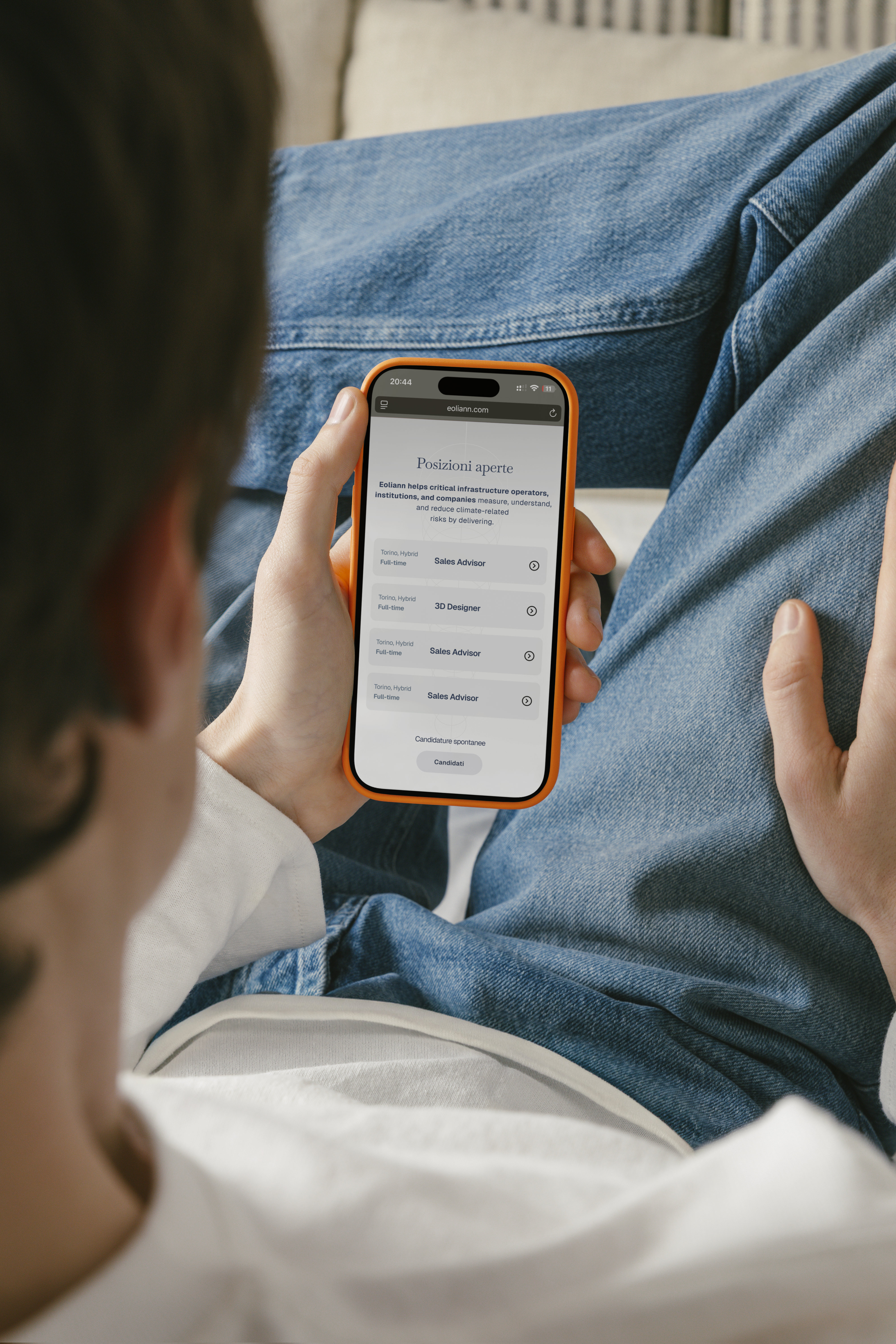
The new site is online. Visitors now have a clear path: understand what Eoliann does, see why it matters, book a demo. Three steps, no dead ends.
The first numbers come after the review with the business developer. They'll be here, whatever they say.
Why wasn't anyone getting in touch? Because the site never asked. Now it does.
Selected Work
What you get